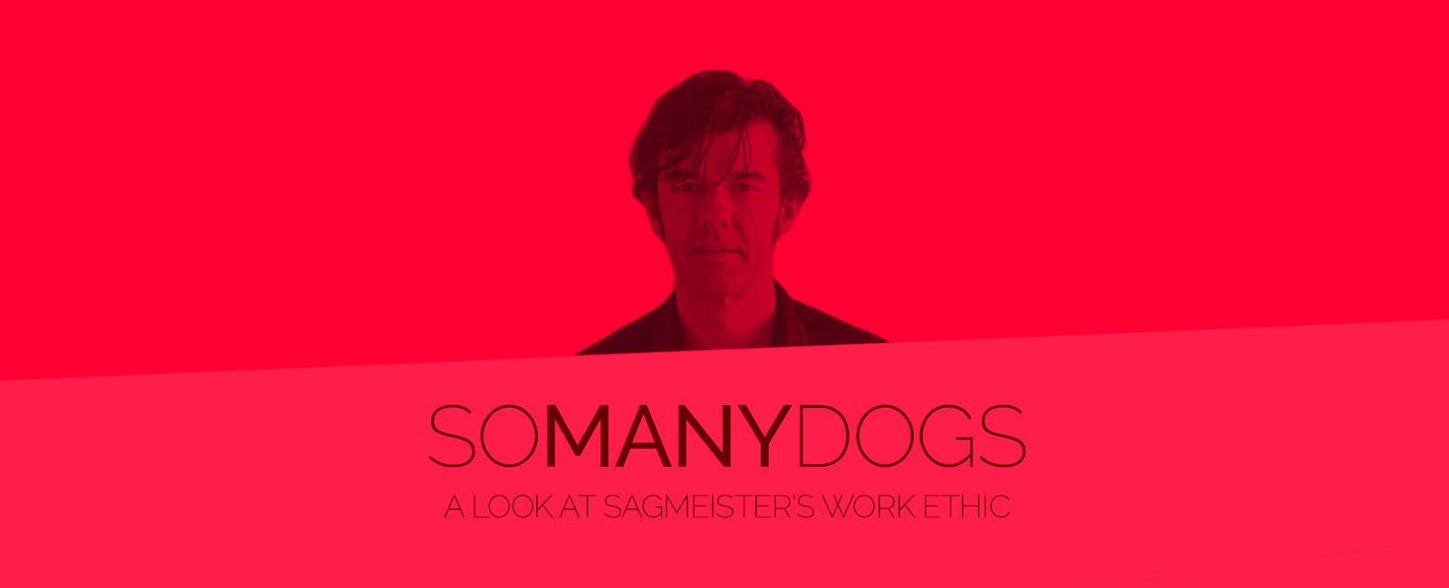

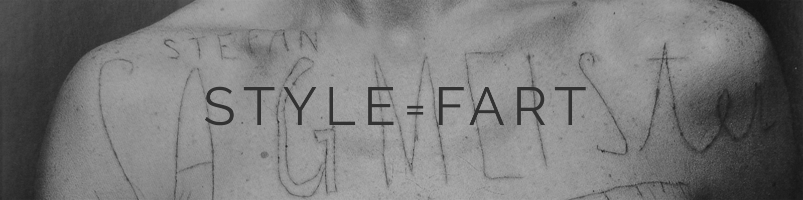
Hanging out of the window of The Empire State Building holding a sign to create a situation he normally wouldn’t find himself in, Stefan Sagmeister really does live up to his ‘Rock star of Design’ title. An unwitting rebel with a cause, expressing himself on as many different platforms and mediums as bodily possible, famously including his own, he is known for his craft in designing artwork for music, typographic installations & experiments and environmental art. Stefan Sagmesiter’s unorthodox and conceptual approach towards the design process began at Vienna’s University of Applied Arts in 1985, before he took up a scholarship at the Pratt Institution in New York city where he now runs the and award-winning Sagmesiter & Walsh studio, established in 1993 after a short stint at M&Co. However, it is his desire to refine his craft and question the language of design that gives him his edge. Through his creative and artistic expression, Sagmeister, is continually examining his own relationship with his craft and how he practices it. He is acutely conscious of his own crippling insecurities, but this very awareness is what affords him the chameleon-like ability to produce innovative and groundbreaking design. This is what enables him to stay current, to adapt, to change his style and certainly his perspective on whatever subject matter he may be drawn to at that time. His early ‘style = fart’ philosophy, which is based on the concept that style is over-rated, was something Sagmeister began to question as his design career developed. “Style,” he conceded did in fact, “contribute to the overall outcome of some designs.” In fact, he is constantly questioning many concepts and norms relating to design and ethic as he pushes himself forward. In 2000 he decided to close his studio. This conscious decision to disengage himself from the arduous demands of clients enabled him to rediscover and explore what his own style was. This would prove invaluable as it not only fulfilled him on a personal level but would also define his future work ethic and associated success.
“'A CUNNING TRICKSTER' WHO TURNS CONVENTION UPSIDE DOWN,
UPSETTING NORMS, TRICKING THE SENSES THROUGH DESIGN”
American Institute of Graphic (AIGA)


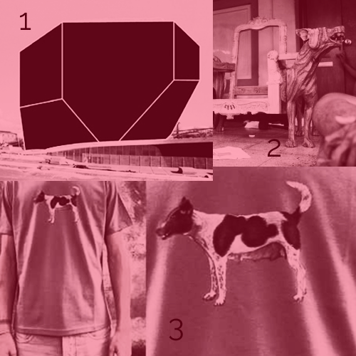
Probably propelled by his mantra, “The first time you don’t know what you’re doing. The second time you do. The third time it’s boring,” instilled in him by his only idol Tibor Kalman from M&Co., Sagmeister’s first Sabbatical allowed him to focus on new directions as he cited that ‘it is helpful to try things out for himself first before doing so professionally’ with no briefs or deadlines. By his own admission he declared that, ‘I did my best thinking when not under pressure & I find it difficult to explore new ideas whilst under pressure.’ On a personal level many designers can relate to his ‘low expectations are a great strategy’ as their best works often come from unexpected and unplanned work such as personal projects. As well as being a year of exploration Sagmesiter would realize that the work and ideas explored during this time would flow back into the studio for years to come and his decision to refine his language of graphic design as opposed to learning the language of another design discipline, for example film or architecture would pay most certainly off. I might devote a lot of time learning this new language and wind up having nothing to say,” he recalled, “it occurred to me I should try to stick with the language I do know how to talk; design, and see if I’d have something to say in it.” His awareness or fear of ‘Sameness’ in the run up to his first break and willingness to experiment with new approaches would pay dividends when on his return to work in his studio when solving a brief for the Portugal’s Casa de Musica in which he designed their logo based on the architectural structure of the building which housed the organization. This was a departure for Sagmeister who had so readily used type to create identity. He further customized the brand language by allowing the logo to adapt a different colour scheme based on the act that was being promoted. This was made possible with help from bespoke software which detected specific colours from an image of the performer and applied this to the logo design. Once again this showed the innovative and individual nature of his thinking and his belief that design is a process and must either tell a story or hold meaning. When Sagmeister questioned the validity of his own output of work in 2008, which at that time was mainly design for music, a second sabbatical ensued and he travelled to Bali; this time get closer to nature in the hope that it would spark new inspiration. “So Many Dogs, So Little Recipes”, the title given to his featuring photographs of 99 local dogs on t-shirts brandishing the same slogan shows his humorous approach to a negative situation in which local feral dogs would ‘attack’ him on his daily morning walk as well as his openness to design based on inspiration and not just a brief, something he had learnt from his first sabbatical. He further exploited this subject by naturally applying it to the design of a chair for his studio, a design language which he had previously chosen not to explore. The results of this project and the ‘Happiness Film’, which he decided to make during and after his Bali sabbatical reinforces his core usage of the sabbatical as a learning, exploratory and experimental tool which he can practice to perfect before taking back to his studio.


Sagmeister ‘learned shitloads in his year without clients, including making up his mind about all the fields he did not want to get into (but had imagined previously that he would)’. Post Sabbatical one and after a 2003 trip to South Korea he conceded that due to the revolution of the MP3 the CD was coming to the end of its lifespan thus meaning, for him, it was time to explore a new direction for his studio despite its main source of commissions being for music artwork. Despite this, his marriage of his two loves of music & design would afford him recognition on a world scale as he produced artwork for iconic bands from Aerosmith to The Rolling Stones His conviction of belief in staying true to his own initial design idea conflicts with his self confessed ‘overzealous perfection’ and insecurity as he describes in ‘Things I have learnt in my life so far’. He talks about how he ignored and ‘self-censored’ Mick Jagger’s request to change the design of The ‘Stones’ Bridges to Babylon artwork (by inserting some large testicles to an illustration of a lion. His reasoning for this decision; solely because he had been previously forced by Aerosmith’s label to change his design and thus had his pride dented. Despite critical acclaim over many years, he lived in fear this rejection from Aerosmith’s label would happen again with the Rolling Stones and so guarded fiercely any suggestion that he should design something which may be questioned by a third party. Sagmeister does describe publication of his own books as ‘Ego, Ego Ego’, but he also openly admits to his fear of rejection stemming from his desire to perfect every piece of work. This Achilles’s Heal like attitude is perhaps which pushes his abilities to the limits.

His design for music is deliberately multi-layered, in a physical and emotional sense, adding narrative and depth to what would otherwise be a superficial and standard communication of the artist name and album title. For example, his design for H.P. Zinker’s ‘Mountains of Madness’ is typical of his ability to trick the consumer by giving the design double entendre. Whilst beneath a red plastic jewel case the expression of the featured male portrait is subdued, on removing it from its case, the expression almost magically become angry and threatening provoking the listener to connect the message Sagmesiter is delivering with the artist and the context of the album title and content. So renowned for his CD artwork is Sagmesiter that he was awarded the 2005 Grammy award for Best Boxed Package for The Talking Heads, Once In A Lifetime’ compilation.


Whilst facing the dilemma of being forced to move in a new commercial direction and reincarnate the backbone of his practice Sagmesiter was approached by an Austrian magazine to fill a 6-page spread. Giving him artistic freedom he Struggled to concoct an original idea so plucked a diary excerpt written during his 1st sabbatical when he had written about things he had learnt in his life so far. This would be the first time Sagmeister would draw on his own philosophical ideas for use in commercial design, and was another interesting result of his time-off, giving his audience a sense of his moral standing and once again his belief in his own expression. One of the most intelligent examples of his ability to create Typographic creations which are living and current was his response to Superbock, (A Portuguese beer brand) approaching him to create a billboard display.
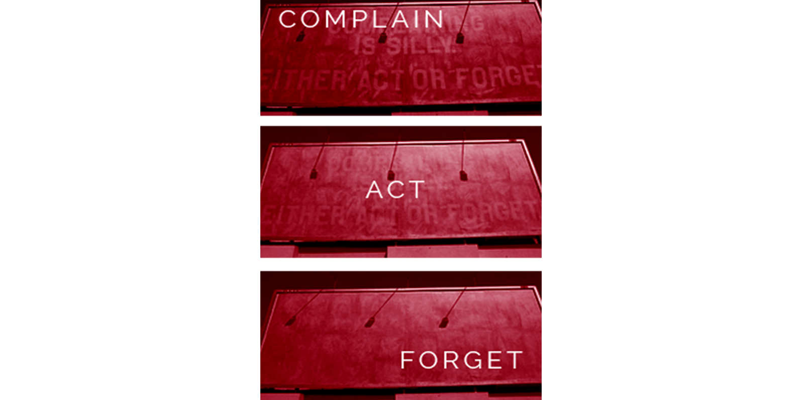
In this creation Sagmesiter cleverly played on the statement’s words by using newsprint which would eventually fade around the type to convey the idea that the message, ‘Complaining is silly, either act or forget’ and the act of complaining, would eventually fade, pointing to his belief of the pointlessness of futile action. Sagmeister continued to eccentrically explore his new love of type when deciding to convey the messages from his diaries in unconventional, sometimes controversial mediums and platforms, creating pictures and narrative with words and type. These would be compiled together in the 2008 publication his second book, 'Things I’ve Learnt In My Life So Far.’ These typographic experiments show the audience his emerging talent as a conceptual and daring typographer – a clear progression from his recognised trade of CD cover designer. Of course, he was no stranger to experimenting with type and medium as his body sculpting ‘advert’ for a 1999 Aiga talk clearly exclaimed. Rather than being attention seeking these are intelligent typographic experiments which demanded audience consideration and thought, allowing him to feel renewed in his creative expression.
Adapting to the demands of the word around him whilst infusing his own design principles and knowledge, being open to learning new things, Stefan Sagmeister is able to curate a constantly evolving craft which produces relevant and interesting creations and earns him the right to be named a true pioneer of design, despite his own insecurities and fears in his ability. His now regular ‘scratching of his 7-year itch’ fuels his evolving sense of artistry and originality and opens his mind to explore ideas which he never thought he would; ‘I learned shitloads in my year without clients, including making up my mind about all the fields I did not want to get into. As a role model his humility and self-doubt is reassuring, as is his openness to trying new design concepts and exploring new design languages in order to stay current and enjoy his job. His drive to push himself to his zenith, acts as a sort of creative crucible, in that he takes his fears and anxieties and transmutes them into design gold. Every designer can learn from Sagmesiter.
As his first publication states, Sagmesiter most certainly...
WORDS, BUILD & DESIGN BY BARRY ROONEY @
FANDANGOH